

CASE STUDY: PRODUCT, DESIGN, & ENGINEERING

A calendar productivity tool for people juggling too many roles — built from an MBA concept into a responsive progressive web app moving from beta toward commercial launch.
Jump to:
Approach
Solution
Tech Stack
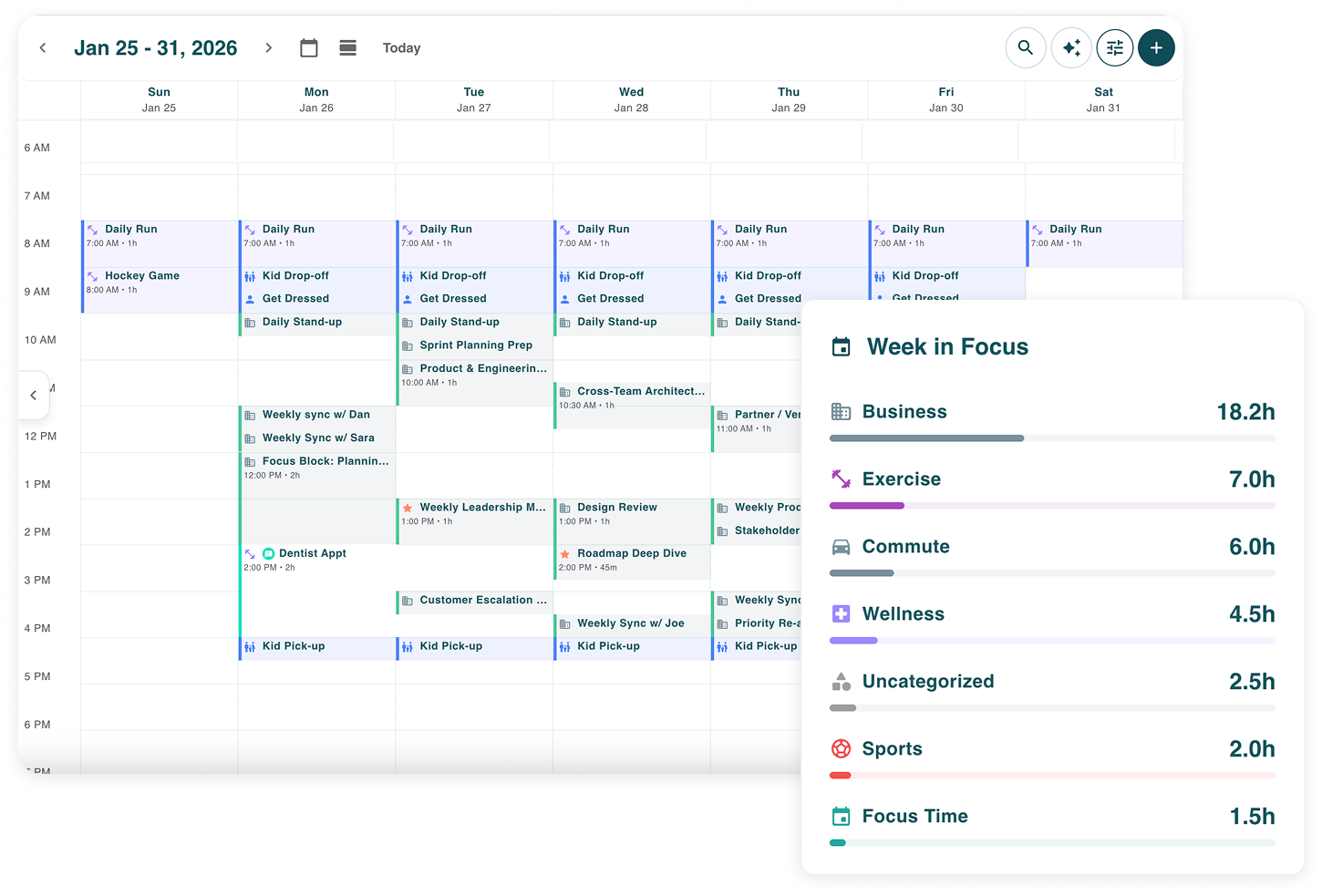
“I need better control of my calendar.”
What started as a simple problem statement became a product strategy: earn trust with a familiar calendar foundation, then differentiate around the moments where managing time creates the most friction.
The Problem
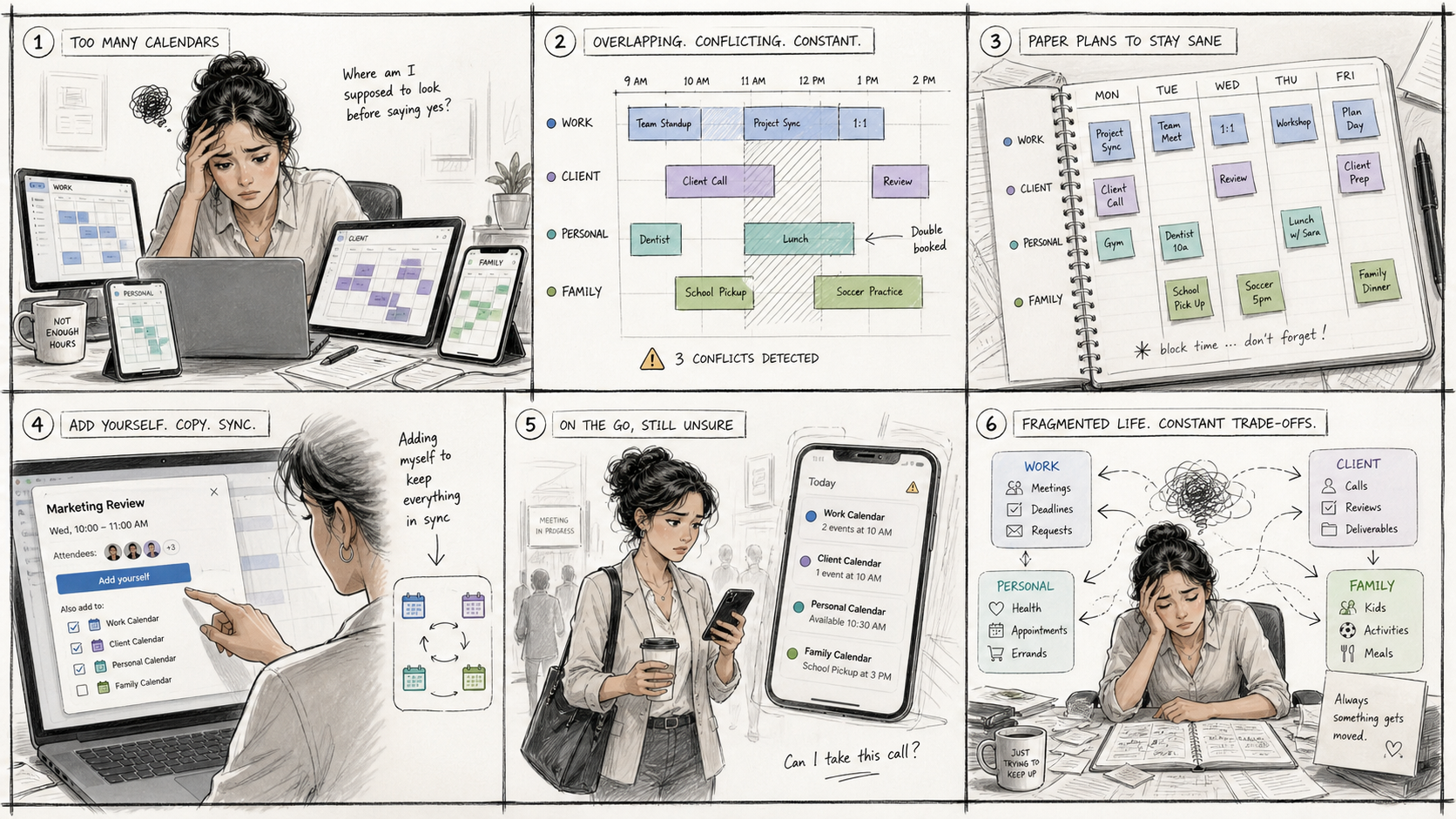
People with multiple roles often live across multiple calendars.
Fractional executives, working parents, consultants, and multi-project professionals are constantly moving between work calendars, personal calendars, client schedules, family obligations, and project-based commitments.
The problem is not that calendar tools do not exist. It is that existing calendars are often fragmented by context.
Users described workarounds like adding themselves to invites to keep calendars in sync, manually blocking time across tools, checking multiple apps before accepting a meeting, or building paper versions of their week just to feel organized.
The pain was both operational and emotional.
When I asked users how they managed time across calendars, the signal was not just frustration. It was resignation. They had accepted that calendar chaos was simply part of modern work.
When I asked how valuable it would be to automatically keep availability in sync across calendars, the reaction shifted immediately to relief, excitement, and a sense of, “Wait, that would actually help.”
That became the opportunity.
Maestro was not about building another calendar. It was about helping people regain control of their time across the different roles they play every day.
Product Thesis
Maestro’s product strategy is to earn trust by first meeting the familiar expectations users already have from Google Calendar, Outlook, and iCal, then differentiate around the highest-friction moments: integrated calendars, protected availability, scheduleable tasks, and a clearer view of what needs attention.
This mattered because users were not going to adopt a new time management tool if the basic calendar experience felt incomplete.
Before Maestro could become more proactive, it had to feel credible.
That meant the early product work focused on foundational calendar behaviors: creating events, editing events, navigating days and weeks, viewing schedules, managing invitations, and presenting calendar data in a way that felt expected.
Only after that foundation was in place could the product meaningfully layer in differentiation.
My Role
I led product strategy, UX, and frontend engineering from concept through beta and toward commercial launch.
My co-founder and CTO leads backend architecture and infrastructure decisions. I partner closely with him on broader technical direction, including database schema design, AI strategy, and architecture discussions, while owning the product experience and frontend implementation.
Product: Strategy & concept · Persona research · Market validation · MVP definition · PLG strategy · Feature flag model · Pricing and tier strategy · Beta → market planning
Design: UX flows · Interaction design · Mobile-first responsive design · Information architecture · Design system · Product storytelling · Website experience
Engineering: React + TypeScript · Customized MUI · Frontend architecture · CSS variables · Component-based structure · Cursor AI-assisted development · Unit testing toward ~80% coverage
Delivery: Git workflow · Code review · Staging review · Manual QA · Beta feedback loops · Production readiness · Release validation
This was a deeply hands-on build. I shaped the product, designed the experience, built the frontend, tested releases, gathered feedback, and used the product daily as one of the target users.
The Approach
Start with the real user, not the original idea
Build for one codebase, many contexts
Design for calm, not complexity
Turn friction into product direction
Prepare for commercialization
Start with the real user, not the original idea
Maestro began during my final MBA semester at Boston University’s Questrom School of Business. My cohort team and I used design thinking principles to explore the problem space, market opportunity, user need, and business model.
The original proof of concept focused on professionals going to graduate school. It was intentionally bare bones and did not account for the full complexity of calendar management, but it gave me something tangible to test and build from.
As I moved beyond the MBA concept, I conducted additional market research and persona analysis. My own experience in the fractional executive space, along with the network I had built across consultants, founders, operators, and working parents, pointed to a stronger market opportunity.
The target user became clearer:
Fractional executives & Consultants
Working parents
Multi-project professionals
People managing work and life across multiple systems
The pain was not niche. It was widespread.
Build for one codebase, many contexts
Maestro was built as a progressive web app, or PWA.
A PWA is a web application that can behave more like a native app. It runs in the browser, can be installed on a device, and can support native-like capabilities such as notifications. This allowed us to maintain a single codebase while still giving users an app-like experience across devices.
Maestro was also built using responsive web design, or RWD.
Responsive web design means the interface adapts across desktop, tablet, and phone. The layout, navigation, and interaction patterns reflow based on screen size, rather than requiring separate applications for each device.
That mattered because calendar management happens everywhere: at a desk before a planning session, on a phone between meetings, while coordinating family logistics, or when quickly answering, “Can I actually take this meeting?” Furthermore, we are a two-person bootstrapped startup and I needed to build a frontend that was easily manageable by one person (me).
Design for calm, not complexity
Maestro was solving a cognitive load problem, not just a scheduling problem. Users were already overwhelmed by fragmented calendars, competing responsibilities, and constant context switching. If the product looked or felt complicated, it would recreate the same stress it was meant to reduce.
My design approach was to create a calm, structured interface that helped users quickly understand what needed attention.
I focused on three principles:
Prioritize what matters now.
Conflicts, new events, upcoming meetings, tasks, and availability gaps needed to be easy to spot without forcing users to interpret dense calendar data.Use hierarchy to reduce noise.
The experience relied on consistent spacing, typography, reusable components, clear UI states, and CSS variables so users could quickly understand what was primary, secondary, or actionable.Design for context switching.
Desktop supported deeper planning with denser layouts and side-by-side information. Mobile focused on quick decisions, touch-friendly interactions, and glanceable views for users moving between meetings or responsibilities.
This mattered because Maestro’s value was not simply showing more calendar information. It was helping users make better decisions with less mental effort.
The technical frontend choices supported that goal: React, TypeScript, customized MUI components, component-based architecture, and shared CSS variables created a scalable foundation for a product that needed to organize complexity without feeling complex.
Turn friction into product direction
Using Maestro every day helped clarify an important product reality: before we could differentiate, we had to meet the baseline expectations users already had from Google Calendar, Outlook, and iCal.
A lot of the early product work was not about inventing something new. It was about building a solid calendar foundation users could trust. That meant replicating familiar calendar behaviors — creating events, editing events, viewing schedules, navigating days and weeks, managing invitations, and seeing calendar data in a way that felt expected.
That foundation mattered because users were not going to adopt a new time management tool if the basic calendar experience felt incomplete.
Once the core calendar experience was reliable, we could use research and daily usage to identify where Maestro should go beyond existing tools. The strongest opportunities emerged around the pain points users felt most acutely: managing multiple calendars, protecting availability across systems, tying tasks to scheduled time, and quickly understanding what needed attention.
That led to Maestro’s differentiated capabilities:
Integrated calendars gave users one place to manage time across work, personal, client, and family schedules.
Smart Blocks protected availability across calendars so users could stop manually copying events or worrying about accidental double-bookings.
Scheduleable tasks connected work to time, helping users plan not just where they needed to be, but what they needed to do.
The Daily Dashboard gave users a week-at-a-glance command center for conflicts, new events, outstanding items, and priority signals.
The product strategy was clear: start by earning trust through familiar calendar functionality, then build differentiation around the moments where existing calendars created the most friction.
Prepare for commercialization
As Maestro moved from beta toward market, the beta process became more than a product validation loop. It also helped clarify which features users were most likely to pay for.
The key learning was that most of the product needed to remain free in order to build trust, drive adoption, and let users experience Maestro as a credible calendar replacement. Foundational calendar functionality — creating and editing events, navigating the calendar, viewing schedules, managing tasks, and using the Daily Dashboard — needed to be accessible without friction.
The first paid tier became focused on the capabilities that created the clearest incremental value beyond a standard calendar experience:
Smart Blocks protected availability across calendars, solving one of the most painful manual workarounds users described.
Extra connected calendars gave users more flexibility as their scheduling complexity increased across work, personal, client, and family calendars.
Booking Link created a Calendly-like scheduling experience directly inside Maestro, allowing users to share availability without relying on another external tool.
Tasks were valuable, but the beta process showed they were more of a “nice to have” in the initial product model. They required users to retrain how they manage time and work, which made them less obvious as a first-tier paid capability. Still, the learnings around tasks were important and will inform a future paid tier as Maestro continues to evolve toward more proactive productivity.
I used these beta insights, user feedback, and a review of existing calendar productivity tools to define the initial pricing model and go-to-market strategy.
From there, I designed the frontend feature flag model to support a product-led growth motion, including plan-based access, in-app upgrade moments, tier testing, Stripe readiness, and flexible feature exposure without separate builds.
At the time of this case study, we were closing the beta while building backend Stripe integrations, testing the tier model, and preparing Maestro for market launch.
The Solution
Maestro evolved into a responsive calendar productivity platform built on a clear product strategy: first meet the baseline expectations users already have from Google Calendar, Outlook, and iCal, then layer in the differentiated capabilities that solve the most painful parts of managing time across work and life.
A lot of the early product work focused on earning trust through the fundamentals. Users needed to be able to create and edit events, navigate their schedule, view their day or week, and manage calendar data in ways that felt familiar. Without that foundation, the differentiated features would not matter.
Once the core calendar experience was solid, Maestro could go further — helping users manage multiple calendars, protect availability, schedule with others, and connect time to the work that needed to happen.
Connected Calendars